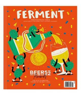
Yeye Weller (Büro Brauerei)
• • • Best Artwork • • •
Robyn Gilmour
Saturday 22 October 2022
This article is from
Beer52 Awards 2022
issue 84
Share this article
For many craft beer drinkers, an initial introduction to the weird, wonderful, vibrancy of our industry comes in the form of a beer’s bright label. Adventurous design can transform caution into curiosity, but while we hear a lot about the beer that a label's design supports and promotes, we rarely take the time to celebrate the artist behind this work.
With the Beer52 Awards providing us with that opportunity for acknowledgement, we leaped at the chance to get in touch with Berlin-based Yeye Weller, the mind behind Büro's bright label artwork. Their work is high concept, and steeped in tradition, but for all that creates an experience that simply wants to “make the observer happy for a while”.
Weller’s design takes inspiration from 1930’s cartoons by Max Fleischer and Walt Disney. “I read a lot of comics in my childhood, and collected stickers and beermats,” the artists says. “I love them to this day. They come from a time when not everybody was a designer because they had Photoshop on their MacBook, and designing soap packaging wasn't done in one morning by downloading two free fonts and stealing a layout from Pinterest.
“I like it when illustrations, layout and lettering are one unit and do not stand out from each other, so I always try to bear that in mind while illustrating layouts. I believe that good designs never really go out of style; that's why I try to let the ‘classic’ live on in a new design language, and combine layouts and cartoon figures that are actually known from the middle of last century with modern patterns, colours or content to create a harmonious picture that balances colour and humour.”
Share this article
You’ve reached your limit of 5 free articles this month.
Unlock unlimited access and more
Join Beer52 and get your first month half price
-
Get your first box for £13.50 (RRP £27).
-
8 beers & 2 snacks delivered monthly.
-
Printed Ferment magazine included.
-
Unlimited access to all online content.
