Rooster's Brewing: For art's sake
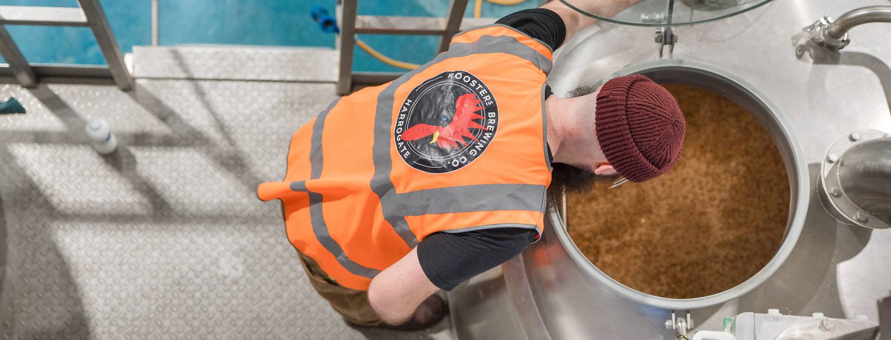
Rooster’s Brewing Company of Harrogate, North Yorkshire, collaborates with David Bailey on a series of labels for its iconic Assassin range.
Robyn Gilmour
Photos:
Mark Newton
Saturday 25 July 2026
This article is from
Yorkshire
issue 133
Share this article
Few breweries, to my mind, are informed by as vast a constellation of influences as Rooster’s Brew Co. There, inheritance, innovation, tradition, modernity, local history and family ties interconnect in such a way that past, present and future are in constant conversation with one another. Operations director Tom Fozard might call these “devices” rather than influences; each furthers the plot, is a communicative tool, an element that tells you something about Rooster’s today but, individually, doesn’t make up the full picture. I borrow this term from our conversation about Rooster’s recent collaboration with illustrator David Bailey on a series of six labels made for the brewery’s iconic Assassin range. “Sod AI, we’ll have none of that slop here,” says Tom. “You can see it a mile away.”
On my short walk from Hornbeam Park station to Rooster’s Brew Co, the carparks of various units are full, with people going to the gym, college, dropping kids off at nursery, or on their way into work at the slew of businesses on the estate. As an out-of-towner, I see the brewery as a modern facility in a bustling business park just one stop on the train from Harrogate centre. Operations director, Tom Fozard, on the other hand, can look at the brewery and be reminded of a time in the mid-90’s, before the building was reclad in modern materials, when the surrounding estate lay derelict. A former compound of ICI, the chemical company famed for the invention of Crimplene (chances are your nan owned a skirt made out of this non-iron synthetic fabric, named after the surrounding Crimple Valley), the estate fell into disrepair when the sale of the company to DuPont, in 1994, saw operations in Harrogate close.
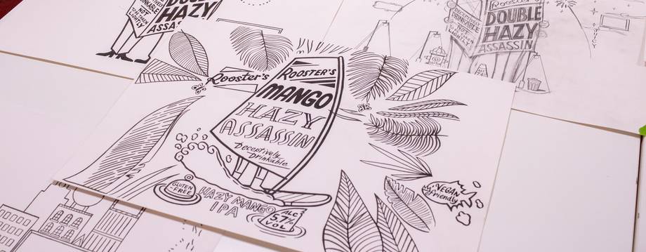
PHOTO: Robyn Gilmour
Tom and his brother Oliver — head brewer at Rooster’s — were then just local teenagers, and Rooster’s was based on a patch of unused farmland, further out of town, still under the custodianship of founder Sean Franklin. A true revolutionary in the beer world at that time, Sean was possibly the first brewer to import US hops into the UK, and was a driving force behind improved standards for hop transport and storage in Britain. As a regular visitor to the US in the 80s and 90s, he saw that American brewers received their hops vacuum sealed and cold shipped — a far cry from anything he'd experienced in the UK. As such, Sean would insist on receiving his whole order of hops for the year in one go, so he could personally refrigerate them, as he knew his suppliers wouldn’t. These anecdotes are just two of many that seem to spill out of Tom on my whistlestop tour of the brewery.
At first, they may seem disconnected from Rooster’s decision to work with an illustrator on label design, but the more time I spend with Tom and marketing manager Kate Stevens, the more evident it becomes that these stories say something about what’s important to the brewery and why it might champion the work of artists. “When I sat down with David and asked him ‘what were you hoping to achieve in these illustrations?’ he replied saying ‘when looking at the designs on these cans, I want people to consider that it's hand drawn and it's crafted, and it took time, just like the liquid inside,’” says Kate, recalling an interview she conducted with the illustrator, when he’d finished work on the six-label series. Of course, the job of the label is to point to the quality of the beer inside, but in Kate’s view, the beer inside can also be used to champion the work of other artisans and artists.
The minute we showed it to supermarket buyers and other customers, they were like; 'cool, when are you going to do the rest?'
If you don’t recognise the name David Bailey, you’ll almost certainly be familiar with his ubiquitous style, as seen in illustrations for Pellicle magazine, CAMRA, Bundobust, the now sadly closed Brownhill and Co, and Manchester’s beloved Nell’s Pizza among many other hospitality businesses. He’s even branched out to work on branding for Patagonia and Cubbit’s Manchester branches. In Tom’s telling, he first reached out to David to ask if he could buy some bespoke-sized prints for the on-site taproom, and the two immediately connected over David’s love of Yankee — Rooster’s flagship beer, the recipe for which was designed by Sean Franklin — and Tom’s love of his illustrations.
Around the same time — mid-2024 — internal conversations were happening at Rooster’s about bringing Hazy-Faced Assassin, a 5.7% hazy IPA, into the brewery’s core range. Treating this shift as a new product launch, the team wanted to throw some weight behind the campaign and commission a special label. Long story short; Tom asked David to get on board, extensive collaboration ensued, and “the minute we showed it to supermarket buyers and other customers, they were like; ‘Cool, when are you going to do the rest?’”. “The rest” — new labels for Baby-Faced Assassin, Easy Going Assassin, Little Hazy Assassin, Mango Assassin and, as a limited edition Peculiar Assassin — would follow over the course of the proceeding nine months.
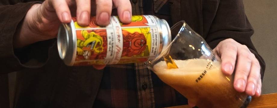
PHOTO: Northern Monk
“There are consistencies across the designs that are really quite fun and playful,” says Tom, reflecting on the project as a whole. “For example, the lettering is all hand-drawn by David, but the word ‘Assassin’ is the font I used to use when designing Assassin labels, so it's got a nod to what it used to look like as well.” Tom would be the first to say he’s no graphic designer — that’s part of why he reached out to David in the first place — but for 13 years, designing Assassin labels fell under his remit and scratched a creative itch for him. For context, Rooster’s Assassin range has developed as a series of riffs and variations on the brewery’s flagship IPA, Baby-Faced Assassin, the recipe for which was devised by Tom in his homebrewing days. It therefore, needless to say, is a series of beers very close to Tom’s heart.
“From minute one, Baby-Faced Assassin was always described as ‘deceptively drinkable, not to be taken lightly’” says Tom. Hence the name. “So, when it came to Hazy-Faced Assassin — the younger sister of Baby-Faced — we came up with this shady character holding a newspaper, as a nod to the origin of the Assassin range. This character is supposed to be suspicious. Who is this guy? What's he hiding? Who is he hiding from? Is he watching or being watched? That’s when we decided to include this other little shadowy figure to his left. These two appear on every can and the idea is that there’s always this obscure dynamic between them. It doesn’t mean anything, but it does tell a story.”
ChatGPT won't visit your brewery, meet your team, listen to your story, and it won't tell your viewers or drinkers about the nuance of your craft
Tom goes on to describe what sounds like creative sparring with David, or at the very least — playing doubles. The pair bouncing ideas back and forth, playing to each other’s strengths, establishing a common language, gathering shared context. The can needed to indicate the beer’s ABV, that it is Gluten Free, and advertise some key tasting notes, so David tucked this information in various “devices”, as Tom calls them, that also say something about Rooster’s history, identity and values.
“When I was talking to David about the background scene that we'd built out around this figure with the newspaper, we took inspiration, again, from Baby-Faced, which we class as an American IPA. While a lot of people might see this beer as a WCIPA it uses our house yeast strain, so technically isn’t. We keep it general by referring to Baby-Faced as an American IPA, and similarly decided — for the backdrop of the Hazy-Faced label — to create a scene that is America-inspired but could be any big city. I did want to have little nods to Britain, so David included the briefcase and the thermos.”
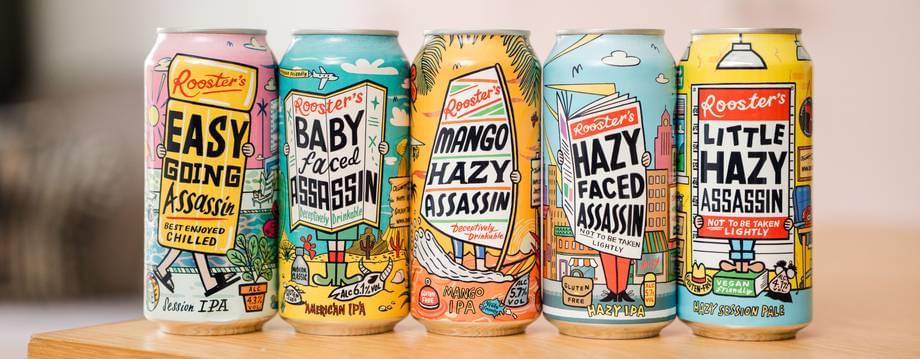
Next up in the label series was Baby-Faced Assassin. “David was really excited about that,” Tom remembers. “Again, it’s an American style of beer, so we wanted to give it an American setting. We’d done the cityscape, so I suggested Venice Beach or Death Valley, and thankfully David ran with the latter. The two colours he chose for this one — turquoise for the sky and yellow for the sand — are actually the colours of the original Baby Faced label, but they were used the other way around, which again is a really nice nod to the beer’s legacy. This time the shadowy figure is watching from the top of the canyon to the left, and tasting notes appear on this roadside billboard. The ABV's on a skull versus being on a flask, so there's devices for everything that follow suit across all labels.”
You won’t find this care and respect and attention to detail in the result of your AI prompts. ChatGPT won’t visit your brewery, meet your team, or listen to your story, and it won’t tell your readers or viewers or drinkers about the nuance of your craft and how you’ve honed it. When the skills, talent and abilities of artists, illustrators and photographers are lost, there won’t be a derelict estate left behind for someone else to discover and rejuvenate. When the world around you is failing to invest in the infrastructure you need to preserve an integral ingredient in your beer — take matters into your own hands, and advocate for higher standards. Just like the myriad of influences that inform what Rooster’s is today, I daresay Tom and Kate’s decision to invest in other artisans will similarly prove a device for future generations to look back on.
Share this article
You’ve reached your limit of 5 free articles this month.
Unlock unlimited access and more

Join Beer52 and get your first month half price
-
Get your first box for £13.50 (RRP £27).
-
8 beers & 2 snacks delivered monthly.
-
Printed Ferment magazine included.
-
Unlimited access to all online content.