Worth a thousand words: The Beer/Art Collective
The Beer/Art Collective: Dugudus, Crispin Finn, Delaney Allen.
Richard Croasdale
Monday 21 May 2018

This article is from
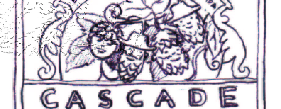
The Hops Project
issue 24
Share this article
Great original artwork has always been a passion for us at Beer52, and has helped shape the award-winning design of Ferment since our first issue in 2014. We’re lucky to have worked with some incredibly inspirational illustrators, designers and photographers from all over the world.
Since we started brewing a limited number of our own exclusive beers last year, we’ve been able to take these artistic collaborations to the next level, finding like-minded people to create some genuine miniature works of art for us. We plan to keep developing these relationships, and further explore how art can help enhance the overall sensory experience of the beers we send out. That’s why we’ve formed The Beer/Art Collective – a more planned, deliberate way of supporting and collaborating with the artists who inspire us. If you’re an artist, and interested in getting involved, contact us at art@beer52.com
Cheers, Fraser Doherty, co-founder, Beer52
DELANEY ALLEN

Delaney Allen is an American photographer whose work investigates self-exploration. Incorporating a unique approach using self-portraiture, still-life and landscape photography, he forms an environment around familiar, yet personal emotions.
He has been exhibited and published nationally and internationally. Most recently, he was chosen as one of Time Magazine’s “51 Instagram Photographers To Follow” for 2016. In 2015 he was chosen as “One Of Portland’s Five Artists To Watch” by the Portland Monthly. He was awarded as a Flash Forward Emerging Photographer by the Magenta Foundation in 2013 and was chosen to attend Alec Soth’s Camp For Socially Awkward Storytellers in the same year. His first publication, Between Here And There, was awarded “Best Books Of 2010” by Photo-Eye Magazine. He holds a BFA in media arts from the University of Texas - Arlington (‘03) and an MFA in visual studies from Pacific Northwest College of Art (‘10).
Speaking about the three labels he provided for The Hops Project, Delaney says: “There’s really not any specific story to these images. All were created for a series entitled ‘Getting Lost’ that was loosely based on my life at that time.”
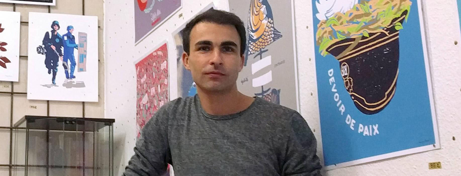
RÉGIS LÉGER
I was very happy that I was offered this project. It’s a real pleasure for an illustrator to see his creations published on different media; I had never worked on beer labels, so this kind of completes my collection!
I like to integrate typography into my designs – a skill which I think has diminished over time, as we’ve all become more reliant on computer tools. I lived for six months in London, where I was influnced by the graphic aesthetic of the signs and logos of shops and other businesses. Great graphic design is found where we least expect. My inspiration also comes from the old labels and graphic composition of the beginning of the century which I like very much.
My illustration work is very linked to the poster, social and political. Its purpose is to communicate about an event or an idea. Synthetic and conceptual work is sometimes more important than the plastic part. We need to find the right symbols, the right words and the right metaphors to make citizens aware of the problems that affect them. Working on a beer label involves a game of seduction with the consumer and is therefore a different aesthetic work. That’s why I wanted to experiment with three different graphic universes. It was a lot of fun to draw!
The main objective is that people want to taste these beers. Then I’ll be happy if people collect or keep the label as a collector’s item. It’s not yet so common to use the illustration in packaging even if the craze for drawing is increasingly important in our societies. It may also be an opportunity for me to open up for future new collaborations across the Atlantic!
DANIEL ARISTIZÁBAL ARIAS
Colombian artist and designer Daniel Aristizábal Arias splits his time between Barcelona and his hometown of Medellín, drawing inspiration from both cultures. His work mainly focuses on surreal and eye-catching imagery.
“I was very excited to be asked to participate in The Hops Project,” he says “I love the crafted beer world and always wanted to do some label design for a beer. I take my inspiration from pretty much anything that catches my attention at the moment; I think I have ADD and got distracted everyday new stuff. I live by the belief that anything can become an art piece. I hope my designs invoke giggles and joy.”
CRISPIN FINN
FERMENTMAGAZINE.COM | ISSUE 21
ADVENTURES IN THE GLOBAL CRAFT ALCOHOL MOVEMENT
We are design duo Anna Fidalgo and Roger Kelly, better known as Crispin Finn. We create illustration and graphic design, often in our trademark colours of red, white and blue. We particularly enjoy the challenges of working within a limited colour palette and creating economic, fun, engaging images and typography.
We liked the idea that all three of our labels related to England – the English Bitter, London Porter and Vanilla Stout – and wanted to create a route that would reflect and celebrate this without evoking any potentially negative or overused nationalistic tropes.
We thought very carefully about the kind of imagery that might work; something that could be quite simple, but that would have charm and could accurately communicate the three gave the illustrations further depth and significance - the luggage label and subtle background pattern of rain for the Porter; a blackbird feather (both culturally and in folklore we felt the bird was appropriate) with a pattern based on vanilla seeds for the Stout; and an Oak leaf (the national tree of England) with the stars of a night sky for the English Bitter.
Beer labels and beer can design these days is a very interesting and exciting territory, particularly now the impact that breweries such as Mikkeller (who really started experimenting with their packaging a decade ago) has been so influential. We wanted the labels to work well individually but could make all three beers feel like a set, and could also stand out from a shelf or display. We also wanted them to have a slightly different styles of beer. The hat idea came to us early on as quite an elegant and novel way to create a nice sense of character for each of them - the top hat for the English Bitter, porter’s cap for the London Porter, and the stout hat for the Stout.
As with many of our projects, we begin with drawn images and notes which we discuss and play around with before taking them into the computer to develop and work up into the actual artwork. For these labels we created different versions with different arrangements of items and details, before arriving at the final illustrations. We wanted to include elements that timeless quality, that would belong in a contemporary context but might also feel at home in a dusty old pub back in the 1950’s.
We hope they evoke positive, charming and evocative sentiments about both the beers and their British heritage, and most of all make people pick one up and enjoy what’s inside!
Share this article
You’ve reached your limit of 5 free articles this month.
Unlock unlimited access and more
Join Beer52 and get your first month half price
-
Get your first box for £13.50 (RRP £27).
-
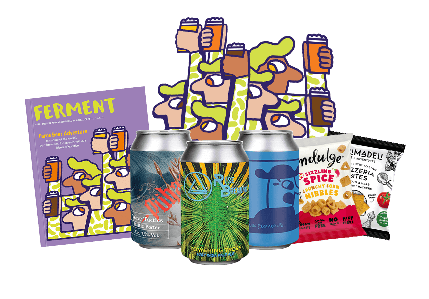
8 beers & 2 snacks delivered monthly.
-
Printed Ferment magazine included.
-
Unlimited access to all online content.
