Eye candy
The craft brewing movement may have torn up the rulebook on beer label design, but’s still part of a grand tradition. Pete Brown asks what makes a successful design today and, crucially, is it art?
Pete Brown
Tuesday 03 June 2025
This article is from
Beer & Art
issue 6
Share this article
When Warhol and the pop artists took tin cans and other commercial design for their inspiration, they tapped into a fertile artistic seam; these objects are utterly disposable, yet plant themselves in our collective subconscious more profoundly than any great work of ‘fine’ art. Beer label designs are art with a purpose – to be memorable, to stand out or to convey something about the beer inside. Yet we rarely give them much thought beyond, perhaps, a fleeting appreciation of a quirky illustration.
Of course, that’s not to say all beer design is great art - far from it. The visual design of beer can be great, but can also be horrifically bad, even offensive. Why is so varied? And does it matter?
These are questions that make some brewers bristle. The beer speaks for itself, they argue. There’s a strong belief that mainstream, macro beers are style over substance, fancy packaging and slick ads with no substance inside. Craft beer, by contrast, is all about the flavour of the beer itself. Plain, simple packaging that has clearly had little thought given to it can, in the minds of some, signal that time and budget has been spent on the important stuff.
Some in the beer world champion this anti-marketing approach with Trumpish devotion. The website ‘Pump Clip Parade’ is a rogues gallery of design that tries to be so-bad-it’s-good but ends up just being so, so bad. In 2016, beers like Dr Fox’s Cunning Linctus (snigger), Blonde Bombshell (“Hey, look – tits!”), Christmas Cracker (“Hey, look – tits again!”) and Rucked: Nobody Rucks Like a Hooker (“Prostitute tits!”) keep alive the saucy spirit of the 1970s as surely and defiantly as they turn a new generation away from cask ale.
This painful puerility suggests that a passing acquaintance with the principles of good branding is not necessarily a bad thing. There are now over 1,700 breweries in the UK, between them producing anywhere between 10,000 and 15,000 different beers. Every single one of those beers has some kind of visual identity, good or bad, professional or amateur, stand-alone or as part of a range. If you brew a beer you’re proud of, why wouldn’t you make it look good? Especially in a visually-led society where choices are made in fractions of a second?
Branding and beer go way back. In 1876, when the UK Patent Office first started registering trade marks, trade mark number one went to Bass ale, after an executive from the giant brewery spent the night waiting on the steps of the office. The distinctive red triangle was as famous in its day as the McGolden arches or Nike swoosh today, and had to be registered because there were so many fake versions of Bass around at the time.
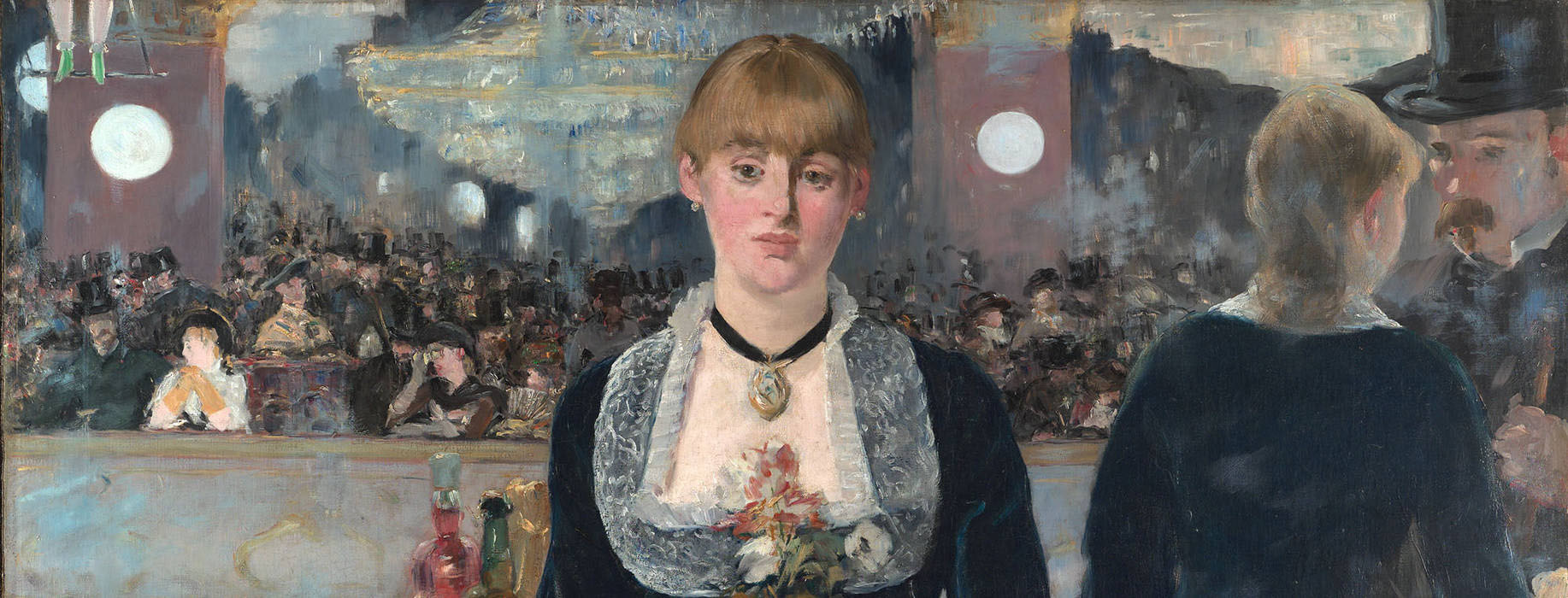
Look at a bottle of Bass today (if you’re lucky enough to find one) and it’s not that different from the one Manet painted on the bar at the Folies Bergères in 1882. Beer is solid and dependable, reassuring and familiar. Budweiser just won a Gold Clio award – the Oscars of the design industry – for a redesign that somehow makes it look more like Budweiser than it did before, but you’d probably only notice the change if you had the old and the new design side by side. The Guinness harp, the Stella Artois crest, and the smiling ‘e’ in Heineken, tilted back so it looks more friendlier, will no doubt always be with us.
Which is why craft beer is a breath of fresh air, a delight to the eye as well as the palate. There are rules of commercial design that must not be broken: a simple and clear design that can easily be identified in a fridge behind the bar ten feet away, a name that sounds good when you shout it across the bar, refreshment cues that immediately tell you this is a beer and not a soft drink or cider. Craft brewers throw it all into a skip and get their mate who did a design course at college to come up with something wacky and garish, something that’s guaranteed to turn the heads of a millennial generation who are the first people to be saturated by sophisticated brand marketing since they were born, who consider themselves to be creative and savvy.
Or that’s the idea, anyway.
Silas Amos has been designing packaging for 26 years. In that time he’s helped define the visual look of beers including Guinness, Stella Artois, Boddingtons and Budweiser. He’s excited about the current explosion of creativity in beer design, but not entirely impressed.
“Craft is like an army of ants,” he says. “It stands out as a body of work, but very little within it stands out individually. It’s less than the sum of its parts.”
What? But isn’t it a glorious riot of rule breaking and creative anarchy?
“There is creativity, but I wouldn’t say we’re in a golden age of creativity,” he says. “It’s like punk. Two or three bands were excellent, and they would probably have been excellent anyway. But they were in a scene where a lot of stuff was shit.”
To a trained design eye, many in the craft beer pack follow a formula just as surely as the big brands do. “A few years ago, Innocent Smoothies changed the game in how to write packaging copy,” says Silas, “and then everyone started doing the same cutesy, lower case style and it became cloying. We see that now with craft design – a wacky name and some kind of anarchic character, everywhere you look. It’s not as zany as it thinks it is.”
There are exceptions of course. So which beers are the equivalent of The Clash and Joy Division, transcending the scene to create something that’s great by anybody’s standards?
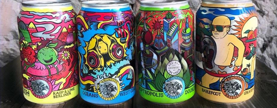
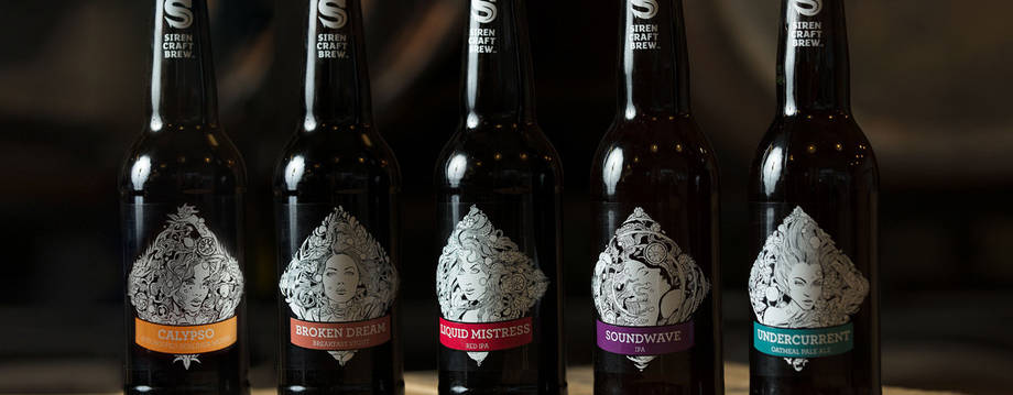
“You can’t get much more ‘don’t give as fuck’ than Kernel,” says Silas. “It’s the ultimate minimalist humble-brag, suggesting supreme confidence in the quality of the beer. And then at the other extreme, you have the ultimate quirkiness of Beavertown.”
Nick Dwyer studied design at university and was working in Beavertown’s original brewpub, Duke’s Brew and Que in East London, when he got the opportunity to design the brewery’s first bottle labels. “I showed my sketchbook to Logan [Plant, Beavertown’s founder] and we realised we had some common interests. Pretty soon that led to him becoming creative director and designer across the business.”
The evolution in Beavertown’s visual aesthetic over the last few years signals a growing confidence and authority. “We keep a consistent tone to the core range,” says Nick. “The pyramid is a hangover from the original designs, but we do follow a pattern – there’s a story. Gamma Ray features spacemen, and the new one, Lupuloid, is the enemy of Gamma Ray. But the Gamma Ray spacemen and the Lupuloid monsters are part of the same world.”
“Beavertown is off-the-wall crazy,” says Silas. “I love the way they use the whole canvas of the can. The whole thing is Beavertown. And the thing about the design is, it’s quite ugly, deliberately so. It’s a double bluff. You’re only going to make your cans look like that if you’re confident about the quality of the beer.”
Cans have revolutionised craft beer design. Brands like Beavertown have used that bigger canvas to make the can synonymous with craft beer, to such an extent that bottles seem boring. But Nick Dwyer has a different perspective on them. “Oh, the limitations,” he sighs. “You can only use six colours, plus the silver underneath. You’ve got to work out where all the mandatory text goes and you have to simplify every element to make it work. When I did our first cans, that’s when I made the shift to a being a designer.”
This is an important distinction. Beer labelling, with a few exceptions, is not art. It is design. It has a commercial job to do. Even an anarchic design that breaks the conventions of beer is doing that job. It’s like the old Bill Hicks routine where he savages the discipline of marketing and then imitates a marketing executive nodding sagely and saying, “Ah, clever, he’s going for the anti-marketing dollar.” Rebelling against the design aesthetic of the industry is in itself a design aesthetic, and tells the drinker what they can expect just as reliably as a can of Carling – which reminds Silas of “a packet of cleaner’s fags” – does for its drinkers.
When the majority of beers look like 1950s sci-fi pastiches, Manga or Pop Art, perhaps the truly revolutionary craft beer design would be one that borrows the traditional ‘race track’ oval and old school script of the traditional Teutonic lager brand.
But that would be design for its own sake, a clever, self-indulgent in-joke. Beer design exists to sell beer. It does that by telling you very clearly, through shared visual cues, that this is a mainstream lager, that is a traditional real ale, and this one over here is a hip, urban craft beer. Just as one glance enables you to distinguish a sub-Fifty Shades porn novel from a bleak thriller, or a heavy metal album from a trance twelve-inch, so all beer labels play to some kind of convention. And that’s no bad thing. It makes the beer world a more visually interesting place to be.
“When I graduated I wanted to work on album covers and posters,” says Nick Dwyer, “But what I’m doing now, these are the new album covers.”
Share this article
You’ve reached your limit of 5 free articles this month.
Unlock unlimited access and more
Join Beer52 and get your first month half price
-
Get your first box for £13.50 (RRP £27).
-
8 beers & 2 snacks delivered monthly.
-
Printed Ferment magazine included.
-
Unlimited access to all online content.
